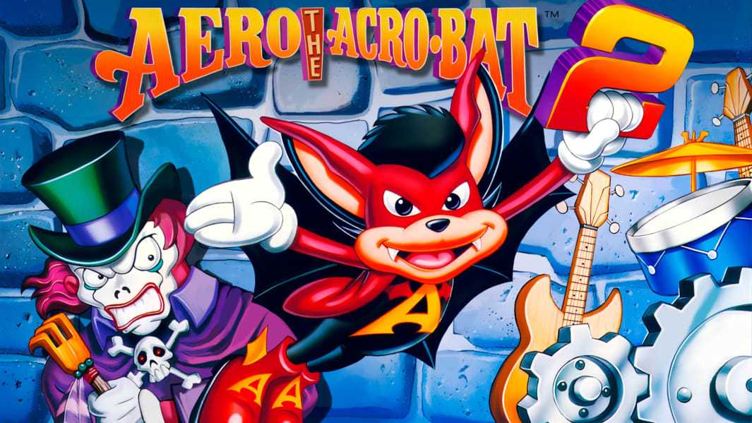
[Review] Aero the Acrobat 2 – Nintendo Switch
Developed and Published By: Ratalaika Games
Categories: Retro, Platformer
Release Date: 09.06.24
Price:  $5.99
Growing up, I had no idea that Aero the Acrobat had a sequel. Well, I do know now and you know what, I actually like this more than the original game.
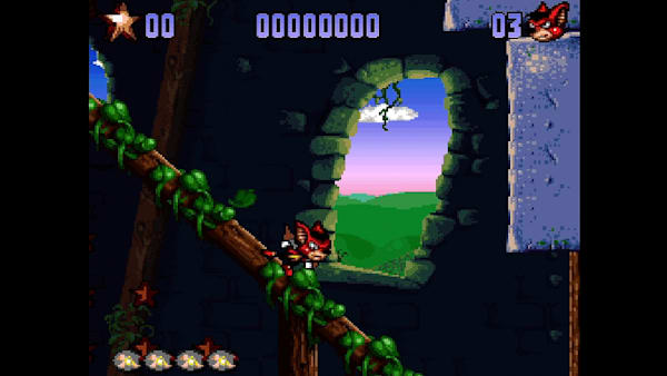
Ok so, first things first. Lets talk the front end. Good lord is it hideous. It’s basic, thumbnails for everything are stretched, black text white background over a checkerboard wallpaper. Sometimes it runs well, sometimes loading sayyyy the pages of the game’s manual take way too long. It almost looks like it came from a poorly or cheaply made flash game. Which is a shame, because the content wrapped in this? Are great. Sprite sheets, indepth galleries, the manual of the game. There’s a music player, there’s achievements. You can even play either the Japanese or Western release of the game.
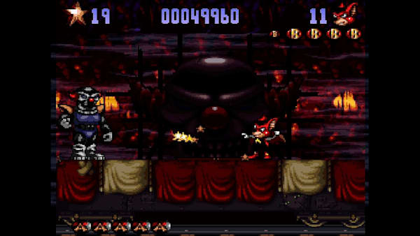
With that out of the way, lets talk the game. I really like it, like a lot. Aero controls and animates so much better than he did before. What seemed like an attempt at the mascot platformer to try and outrank Sonic, to only really gain prominence from Sunsoft’s marketing has evolved into a pretty creative platformer. I do have to admit, the circus theme isn’t used too often, but I’ve never been a huge fan of it. The sequel starts off in a castle, then you’re snowboarding. And yes, you aren’t in the circus for the entire game, but it does feel like it overstays it’s welcome. The variety in the sequel comes immediately and it even changes up things like the gameplay.
Speaking of which. I did mention the game just feels better to play? A big part of that for me is the aerial attack or dive you had. It never felt like you had decent control over it in the first game. But here, it just felt like a decent double jump that *doubles* as self defense. It’s honestly the biggest issue I had with how the first game felt and it’s fixed here.
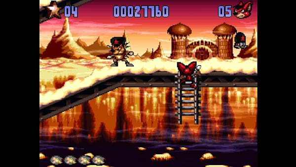
The variety in levels also means a variety in sprites and backgrounds. Environments, hazards, Aero’s cute little animations. This feels more like what could have been done with more time. If I had to make a single complaint, the cutscenes are kind of hideous. Not from a technical point, but the sprite for Aerial in stages is cute, and the cutscenes sprites for her are uncanny to say the least.
Final Thoughts
I wish as a kid I had this game or knew about it. Suppose marketing for the sequel wasn’t there, but damnit is it a better game. Glad to finally experience it.
